
The Changing Global Diet
Food supplies around the world have changed dramatically in the past 50 years. Scroll below to learn more about global change in the diversity of crops we eat.
Click the links at left to explore food supply diversity change in specific countries, compare countries to one another, learn about the changing importance of particular food crops, see how similar food supplies around the world are becoming, and compare the diversity within countries’ modern day food supplies.
The Changing Global Diet story
How many crops feed the world? How diverse is the global diet? What changes are happening in different countries’ food supplies over time? Follow the storyline below to see our exploration of these questions.
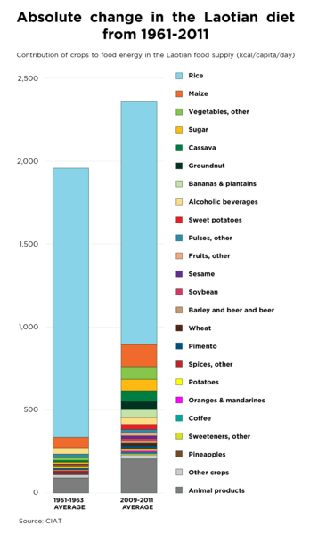
Crops
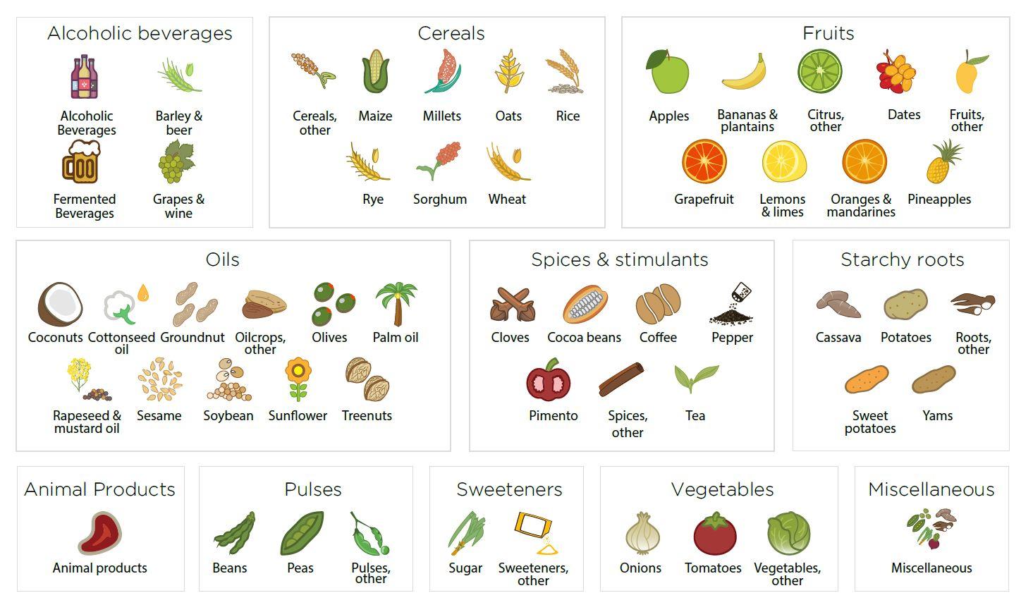
We studied the changing contributions of all 53 crop commodities measured in United Nations Food and Agriculture Organization statistical data (FAOSTAT) that contribute to calories, protein, fat, and food weight in national per capita food supplies. Animal foods were included as a single commodity where needed to place the findings in the context of the total food supply.
Countries
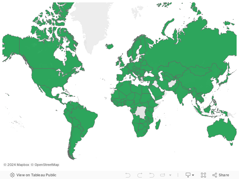
We studied the food supplies of 152 countries, representing 98% of the world’s population. To study as much of the world as possible across the entire time series (1961 to 2009), we standardized areas that changed over the past 50 years, for example by recombining the countries formerly in the USSR and Yugoslavia.
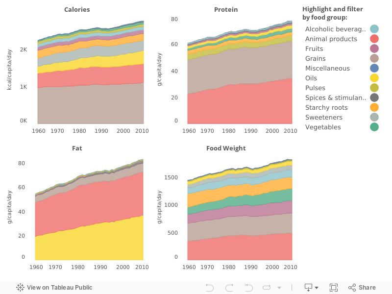
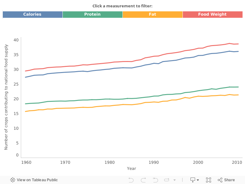
National diets became larger
We found that, on average, countries’ food supplies from both plant and animal sources consistently grew over the past 50 years in terms of calories, protein, fat, and food weight. Oils as a food group had the most dramatic increase.
National diets became more diverse
Around the world, countries added new food crops to their diets. Countries’ food supplies incorporated an average of nine new crop commodities contributing to calories, six to protein, five to fat, and ten to food weight.
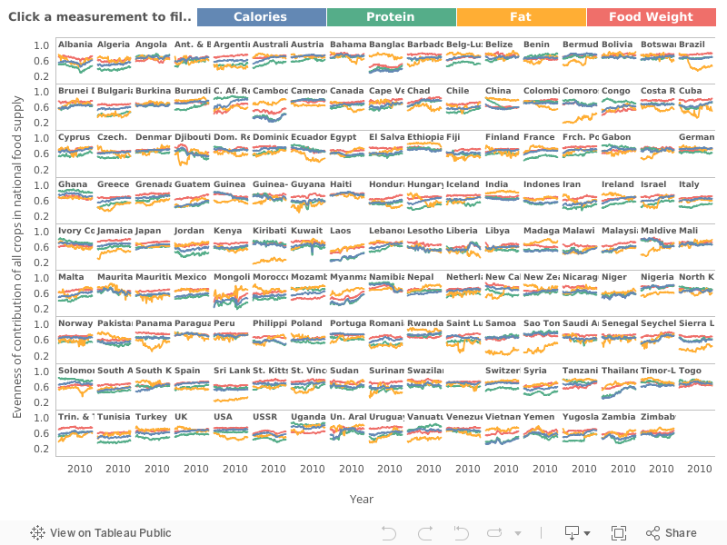
National diets became more balanced
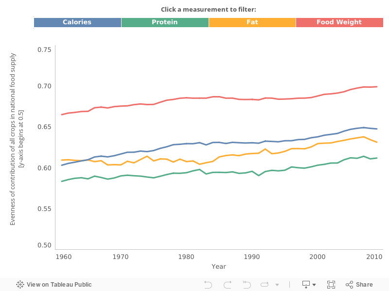
Most countries’ food supplies increased in evenness, meaning that each crop in the food supply contributed more equally to the diet.
The evenness scale refers to Pielou’s Evenness Index, where 0 is a diet totally dominated by a single food, and 1 is a diet where all foods contribute an equal amount.
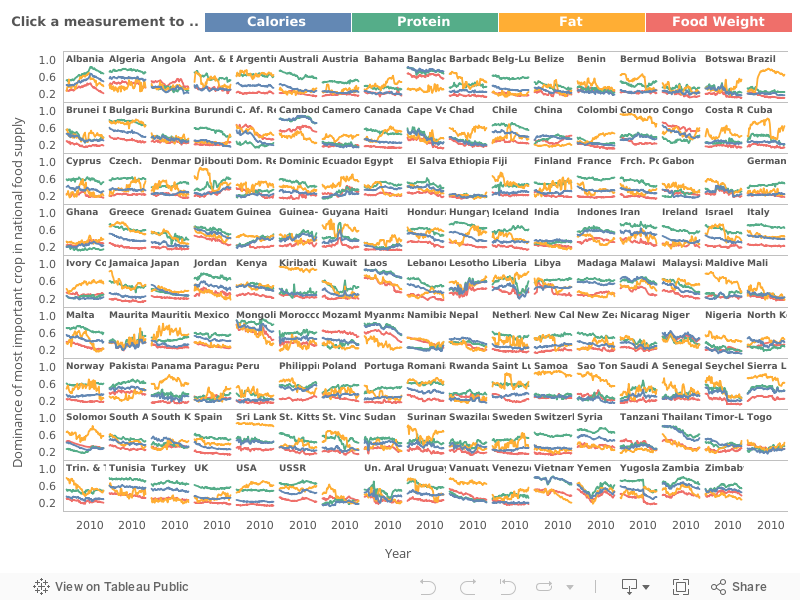
The most dominant foods in national diets became less important
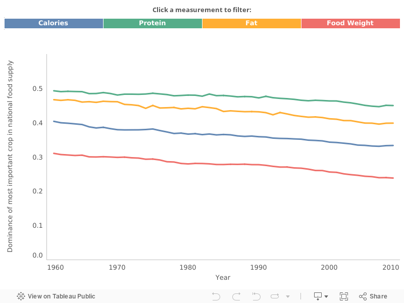
The proportion of countries’ food supplies comprised of the most abundant crop commodity declined on average. Particularly notable reductions in originally very high levels of dominance were visible in rice in contribution to calories in Southeast Asia, coconut for fat in Pacific Island countries, and groundnut for fat in Central African countries.
The dominance scale refers to percent contribution to the national food supply by the most important food (whichever it is), where 0 means no contribution, and 1 means 100% contribution to the food supply.
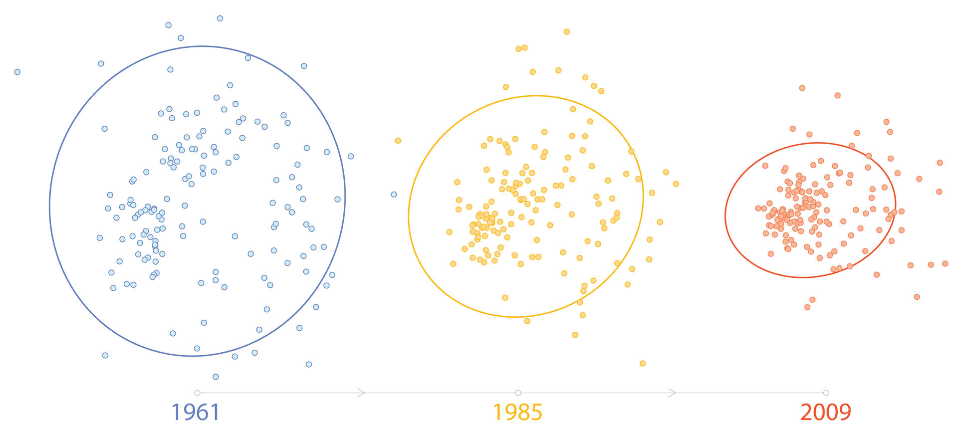
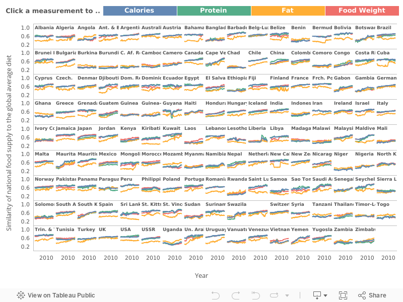
National diets became more similar worldwide
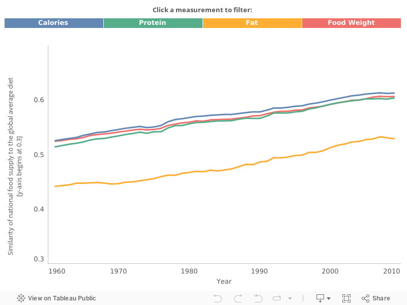
As countries’ food supplies became more diverse in number of crop commodities, and the contribution of each of the crops became more even, food supplies worldwide became more similar. East and Southeast Asian as well as sub-Saharan African countries underwent the greatest changes toward a global average diet.
The similarity scale refers to an adapted Bray-Curtis Dissimilarity distance, which measures the distance in the composition of the food supply (both crops and animal products) in each country to the global average diet, where 0 means very different from the global average, and 1 means completely equal to the global average diet.
This work is associated with the publication:
Khoury CK, Bjorkman AD, Dempewolf H, Ramírez-Villegas J, Guarino L, Jarvis A, Rieseberg LH and Struik PC (2014). Increasing homogeneity in global food supplies and the implications for food security. PNAS 111(11): 4001-4006. doi: 10.1073/pnas.1313490111.
Share your changing global diet story with the hashtag #changingglobaldiet
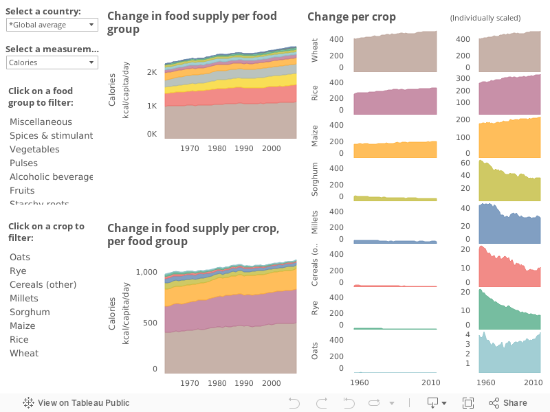
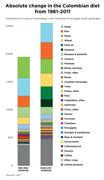
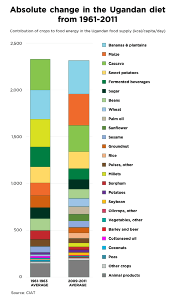
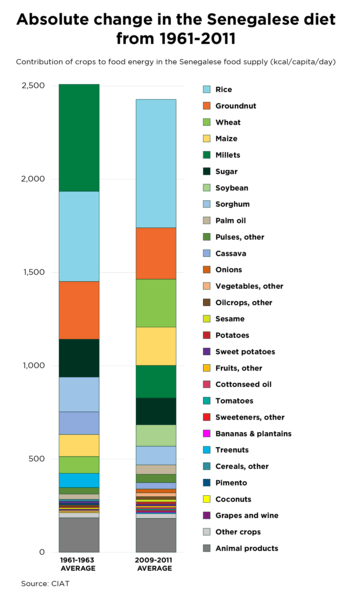
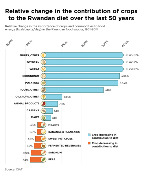
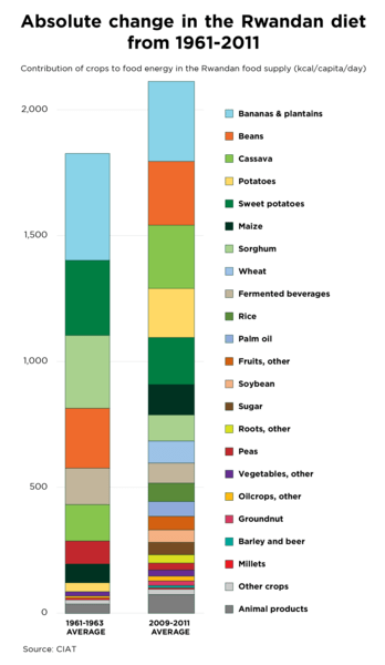
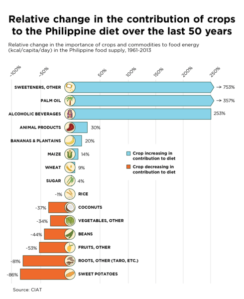
Country Exploration
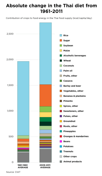
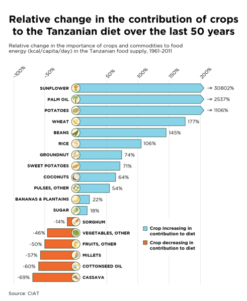
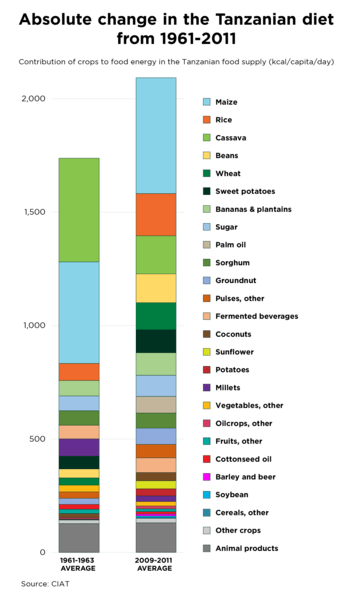
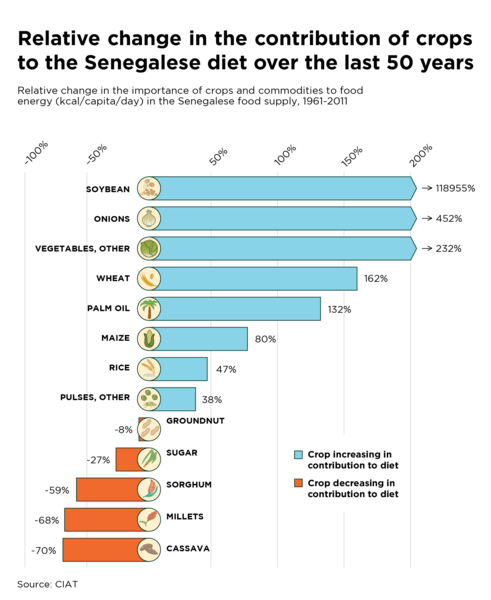
Select a country and a measurement to view changes in the contribution of food groups, and the crop commodities and animal products within them, to the national food supply. Hover over a food group for detailed changes for each crop commodity. Food groups and commodities are listed in increasing order of importance.
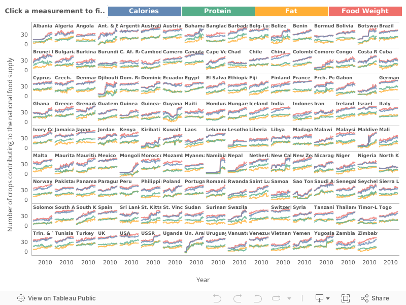
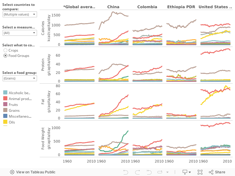
Country Comparison
Select various countries of interest, one or more measurements, and food groups or crops to compare changes in the diversity of countries’ food supplies over time. Also compare to the global average diet (“*Global average”). Choose which crops to compare by choosing a food group.
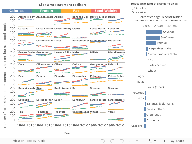
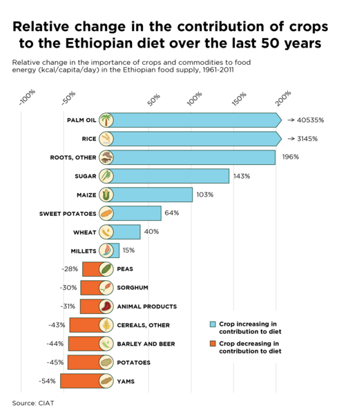
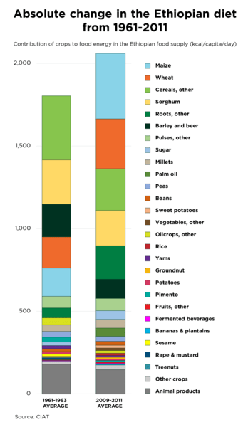
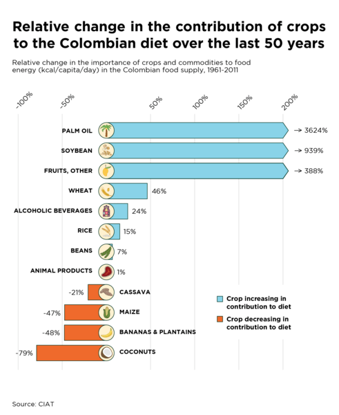
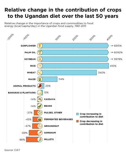
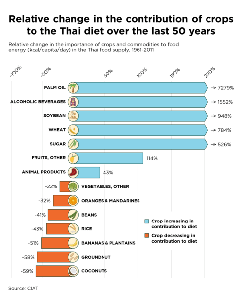
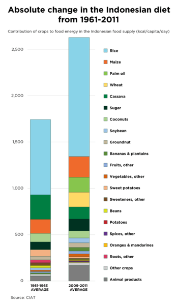
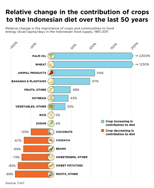
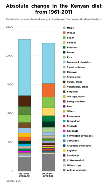
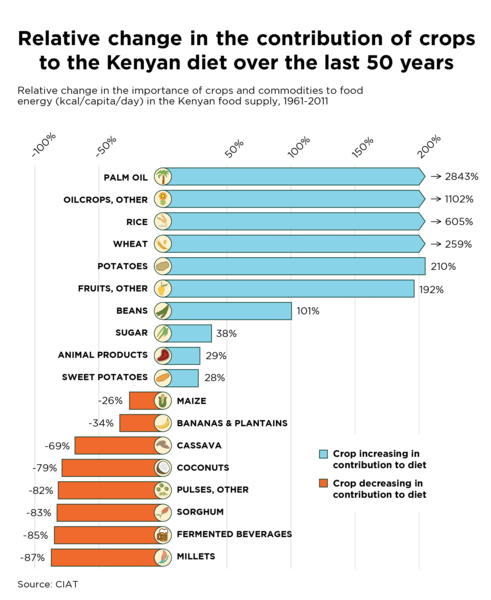
Crop Trends
The world is eating more similarly, so what does the global average diet look like? Which crops have become the most important, and which have declined?
The graph at left shows the change over time in the number of countries that report each commodity as contributing to its food supply. The bar graph at right displays the global average change in the contribution of each commodity (i.e., changes in importance averaged across all countries), measured as the difference between current (2007 to 2009 average) and starting year (1961 to 1963 average) importance.
Select a measurement to view changes in the importance per commodity to calories, protein, fat, and food weight. Click “Relative” to see the change in contribution of each commodity in relation to the overall global average food supply, which has increased in total quantity over 50 years. “Absolute” displays the change in contribution of each commodity only in relation to itself. For each measurement, only commodities contributing 1% or more to food supply during the time period are displayed.
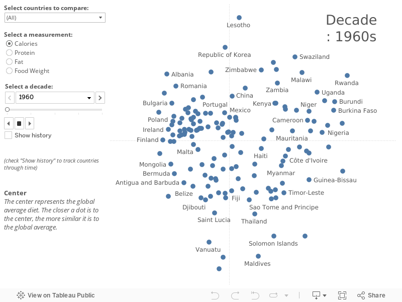
Increasing Homogeneity
Watch as the food supplies in countries around the world become more similar over the past five decades. Each dot represents a country’s average per capita food supply in a given decade, including both the number and the relative abundance/evenness of the crops and animal products that contribute to calories, protein, fat, and food weight. The farther apart dots are, the more the countries’ food supplies differ, with countries at the edges varying most from the global average diet (center).
View all countries or select countries of interest, select a measurement and scroll through decades using the slider. Check the “Show history” box to track change across decades.
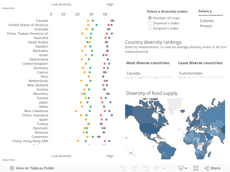
Diversity
How diverse are countries’ modern day food supplies? Each dot marks the estimated diversity level of each country’s current (2009 to 2011 average) national per capita food supply. Diversity is measured in terms of the total number of contributing crops in each country, and by two common diversity metrics (Shannon’s and Simpson’s) that account not only for the total number of crops, but also the relative abundance/evenness of each crop commodity contributing to the food supply (the more evenly all crops contribute, the more diverse the diet is considered to be). Countries are listed from most diverse to least.
Select a diversity index, and hover or click on calories, protein, fat, or food weight to filter for that measurement. Also view countries on the map and see the lists of most and least diverse countries in the tables.
About The Changing Global Diet
About the data, analyses, and figures
We analyzed national per capita food supply data (picture this as the average food available to the average person in each country) for all available measurements [calories (kcal/capita/day), protein (g/capita/day), fat (g/capita/day), and food weight (g/capita/day)] reported by the United Nations Food and Agriculture Organization Statistics Office (FAOSTAT). National food supply data for plants is calculated by measuring national production of these crops, plus any imports, plus or minus any national food reserve changes during that year; minus any exports, any quantities used for seed, animal feed, or in the manufacture of non-food products, and minus any losses that could be measured during storage and transport of the food. Food supply data offers an approximation for diet, which is very difficult to measure in standardized ways around the world, e.g., because it is challenging to account for how much of this food is wasted or otherwise not eaten by people within their households, versus how much is actually consumed.
We analyzed all the crop commodities and countries reported in the FAO database, standardized across all years (1961 to 2009). Plant commodities clearly comprised of the same crop species were aggregated into single commodities representing the crop species, for example, olive oil and olives were combined. After aggregation, a total 53 crop commodities remained. Animal foods were included within the analysis as a single aggregated commodity where needed to place the findings in the context of the total food supply.
In order to align all time periods and include as much of the world’s population as possible, the current nations formerly comprising the USSR, Yugoslav SFR, Ethiopia PDR, and Czechoslovakia were aggregated into their former states, with national data merged by weighted average based upon population of the respective states at the respective reporting year. Belgium and Luxembourg were reported together from 1961 to 1999, and, therefore, recent years listing the countries separately were merged as above. The resulting 152 comparable countries comprised 98% of the world’s population across the study period (1961 to 2009).
We examined the total amounts of food contributing to national food supplies, both by food group and by each specific crop, in each country in each year. We also counted the total number of crops contributing to food supplies. We used Pielou’s evenness index to measure how equally crops contributed to each country’s food supplies in each year. We also analyzed changes in dominance, defined as the change in the contribution of the most abundant crop commodity in each country in each year. We quantified the similarity of countries’ food supplies by calculating the Bray-Curtis distance (dissimilarity) from each country to the global centroid (comparable to the global mean commodity composition, which is inclusive both of the number of crops and also of the relative abundance/evenness of crops) in each year, with similarity derived by subtracting dissimilarity from 1. We further interpreted similarity using a non-metric multidimensional scaling analysis (NMDS) analyzed in three dimensions for convergence and visualized in two, with Bray-Curtis dissimilarities used to compare changes across decades (data points for each country were averaged across 1961 to 1969, 1970 to 1979, 1980 to 1989, 1990 to 1999, and 2000 to 2009). To provide further estimates of the diversity of each country’s current food supply (annual national per capita data averaged across 2009 to 2011), in addition to the total number of crops reported, we calculated two diversity metrics (Shannon’s and Simpson’s) that account not only for the total number of crops, but also the relative abundance/evenness of each crop. Analyses were performed in R packages “vegan” and “lme4”. Interactive figures were built in Tableau.
This poster displays some of the major changes in the diversity of countries’ food supplies worldwide over the past 50 years (online version | printable version).

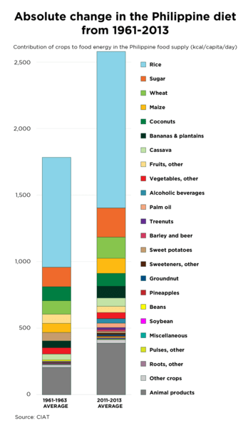
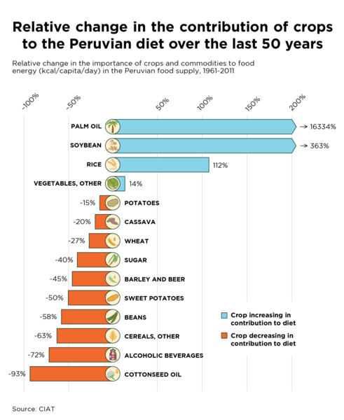
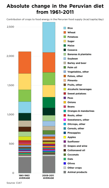
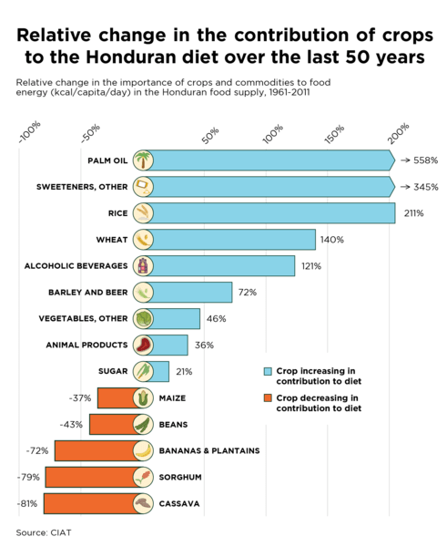
The graph repository below contains an assortment of downloadable figures on changes in food supplies and production systems in various countries, and as a global average.
Graph repository
The Changing Global Diet was built by Sara Kammlade, Colin K. Khoury, Steven Sotelo, Harold Achicanoy, Anne Bjorkman, and Carlos Navarro-Racines, at the International Center for Tropical Agriculture (CIAT). This is Version 1.0 (April 2017). This work is licensed under a Creative Commons Attribution 4.0 International (CC BY 4.0).
The data and analyses shown here are associated with the publication:
Khoury CK, Bjorkman AD, Dempewolf H, Ramírez-Villegas J, Guarino L, Jarvis A, Rieseberg LH and Struik PC (2014). Increasing homogeneity in global food supplies and the implications for food security. PNAS 111(11): 4001-4006. doi: 10.1073/pnas.1313490111.
For an assortment of examples of media coverage of the published research, see these articles in National Geographic
| Guardian | BBC | Time Magazine | NBC | NPR | LA Times | Reuters | Scientific American | Scientific American graphic | Voice of America | Slate | Eat This Podcast | The Scientist.
We’d love to hear from you about the changes in food supplies that you find interesting. Build and share your own infographics, and tell the story with the hashtag #changingglobaldiet.